Summarize this article with:
The chances are that you’ve seen your share of ugly corporate signage. Maybe it was a flashy logo plastered on a building, an illegible sign in front of a business, or perhaps even a company website that’s hard to navigate. Whatever the case may be, poor signage can ruin your company’s image and cost you future business.
Your corporate signage must be able to do three things: catch the eye, convey a message, and leave a lasting impression. If your signage doesn’t do all three things, it’s not doing its job.
Here are four corporate signage mistakes that you can’t afford to make:
Your Signage isn’t Weatherproof
Your signage is one of the first things potential customers will see when they pull up to your business. If your sign is faded, peeling, or otherwise damaged by the elements, it will reflect poorly on your company.
Invest in high-quality materials and professional installation to be sure your signage will withstand anything Mother Nature throws its way.
The best signage material for withstanding the elements is aluminum. Aluminum signs are durable, long-lasting, and low-maintenance.
If you are specifically looking for parking lot paint, opt for water-based paint. Water-based paints are easier to apply and remove, and they won’t damage the asphalt as oil-based paints can.
Your Signs Aren’t Legible.
This one seems like a no-brainer, but you’d be surprised how many businesses make the mistake of using small, hard-to-read fonts on their signs. If your sign is difficult to read, people will simply walk by without giving it a second thought.
Make sure your signs are legible from a distance and use easy-to-read fonts that will grab attention. You don’t want your signs to be an eyesore – make them easy on the eyes, and people will take notice.
Your sign is one of the first things potential customers will see when they
You’re Not Taking Advantage of Color
Color is one of the most powerful tools you have at your disposal for signage. Use color to grab attention, direct the eye, and communicate your message.
However, many businesses mistake using too little color or colors that blend in with their surroundings.
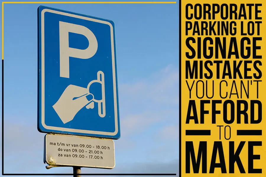
Make sure your sign pops by using bright, bold colors that will grab attention from a distance. And be strategic about the colors you use – different colors can convey different messages. For instance, blue is often associated with parking for disabled people, while red indicates no parking.
Choosing the Wrong Location
Another common mistake businesses make is choosing the wrong location for their sign. The location of your sign is just as important as the sign itself.
You want to make sure your sign is visible from the street and has enough foot traffic in the area to generate interest. Placing your sign in a busy intersection or near other businesses is usually a good bet.
Conclusion:
At Proline Parking Lot Maintenance, Inc., we take pride in being the Greater Charlotte Area’s #1 Pavement Maintenance Company. With years of experience, we’re committed to helping your business maintain a clean, safe, and professional-looking parking lot.
Clear, accurate signage plays a major role in creating that experience. By avoiding the common mistakes mentioned above and by relying on trusted signage installation services, you can ensure your Charlotte, NC parking lot stays organized, compliant, and welcoming to every visitor.